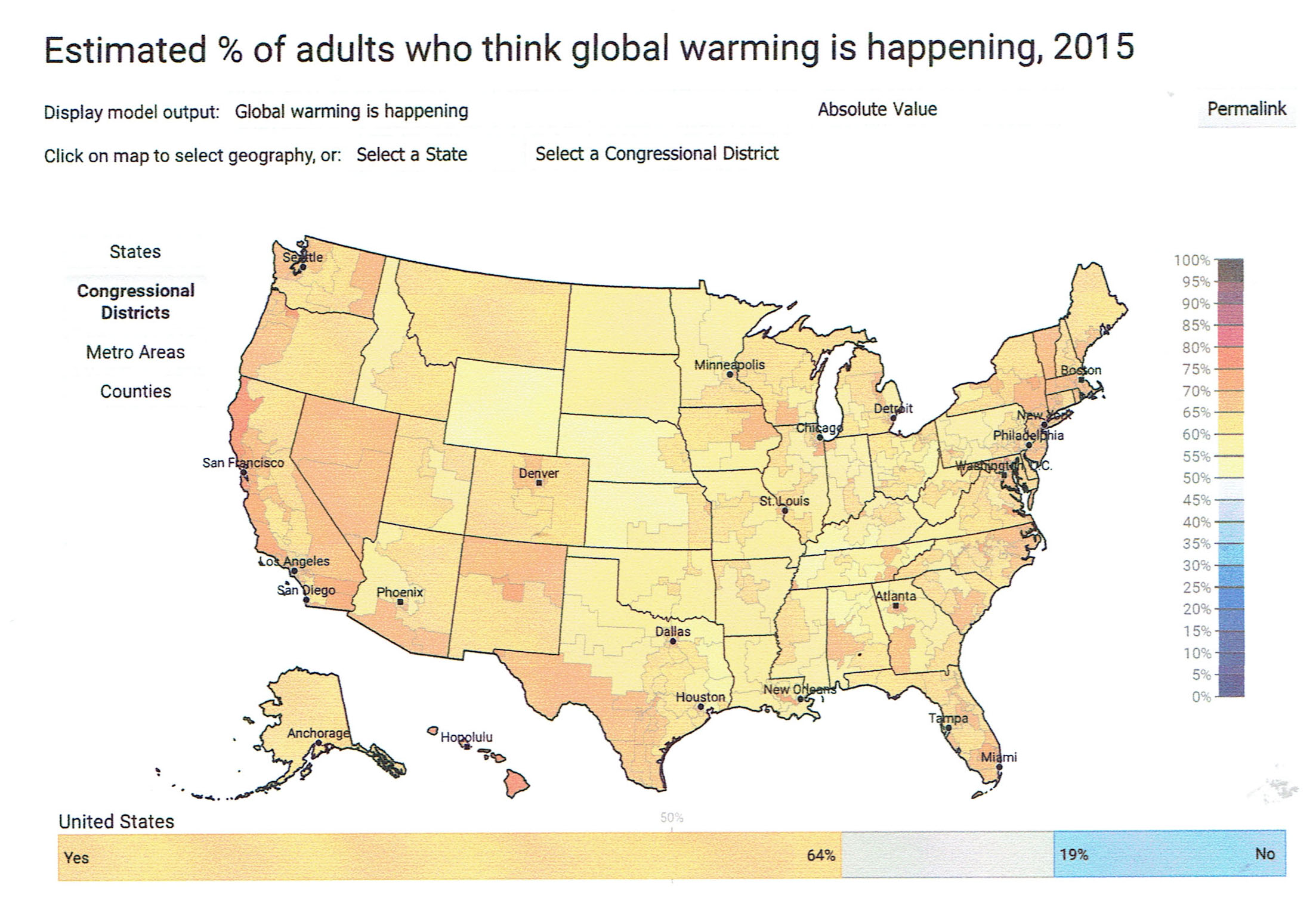
The map below is a sample from what is one of the coolest data features I have seen in a long time. The maps, which are produced by Yale University’s program on climate change communication, have recently been updated to incorporate data through 2016. Nationally, 70 percent of all Americans think climate change is happening, Yale said, but what sets the data apart is the ability to disaggregate it; you can chart opinion by state, county, and congressional district, and you can explore opinions on a range of different questions. The upshot is, it is hard to believe we are still debating the issue on Capitol Hill when you look at the findings: The graphic I have included charts opinion via congressional district and there isn’t a shade of blue (less than 50 percent that think climate change is happening) anywhere.
The following link will take you to the Yale climate maps where you can customize the charts to your heart’s content.
http://jsl6906.net/Clients/YaleClimateChange/MapPage/Combined/?est=happening&type=value&geo=county
I could spend hours there, I certainly hope some Republican members of Congress (or at least some of their staffers) will take the time to do so as well.
To return to the main page, click here.
 Follow